IMAGINE LEARNING MASTERBRAND
Project Brief
As Imagine Learning’s portfolio continued to expand, the company needed a clearer way to present itself as a unified organization while preserving the unique identities of its individual offerings. The masterbrand initiative established Imagine Learning as a distinct entity above the portfolio without visually competing with the products and services it represented. The philosophy was to treat Imagine Learning like a publisher, drawing inspiration from other entities in the education and technology spaces such as Penguin Random House, Scholastic, and Microsoft.
I directed the development of a scalable identity framework governing how the masterbrand appeared across marketing materials and customer touchpoints. The system standardized the use of the Imagine Learning logo and monogram, portfolio breadcrumbs, color, typography, and company information, giving internal teams and external partners a practical set of rules for creating a consistent, connected brand experience while providing a flexible foundation for future expansion and acquisitions.
Skills Demonstrated
Brand Architecture
Layout
Typography
Project Role(s)
Creative Director
the logo and monogram
To guarantee consistency and minimize confusion, three acceptable presentations of the Imagine Learning logo and logotype were approved for use at a masterbrand level. They are ordered in order of precedence. Because the monogram serves as the official ‘icon’ for the Imagine brand - in lieu of an actual mascot, mark, or pictograph - the idea to treat the monogram similar to those points of inspiration (Penguin, Scholastic, etc) as a way to ‘stamp’ Imagine Learning assets and collateral.

TAGLINE LOGO (DEFAULT) The ‘default’ appearance of the Imagine Learning mark to be used whenever possible; especially if the logo will only appear once across a given experience (i.e. - ads, event signage, a single page flyer)

FULL LOGO Should be used as the 2nd option to the tagline logo if the logo appears multiple times across a single experience (i.e. - a catalog or webpage)

MONOGRAM Use the monogram where space is at a premium and as a way to 'tag' an asset with the IL brand.

Approved presentations of the monogram to establish its use as a recognizable mark.
colors and typography
The darkest shade of purple from our full color palette, or Purple 6, was chosen as the primary official Imagine Learning Masterbrand color. Black, white, and the Accent Purple are also available to provide flexibility and contrast.
In order to suit different uses and contexts (i.e. - when speaking at a masterbrand level but also including information about a specific product), an additional brand color associated with the product(s) can be employed within a given asset.

The Imagine Learning primary typeface is Hellix. All weights of Hellix shown below are available to be used for IL branded material. Alternate font: Tenorite for it’s similarity to Hellix. Web-safe font: Verdana

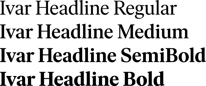
The secondary typeface for Imagine Learning is Ivar Headline. Ivar is exclusively reserved for masterbrand applications and should be used for lengths of text less than 26 characters.
breadcrumbs
Imagine Learning has a broad and diverse product portfolio; products span multiple grade bands across several verticals. To help inform and educate internal staff, field staff, and our customers and prospects about where a given product lives within the portfolio, we built a labeling system for marketing materials we titled ‘breadcrumbs’.
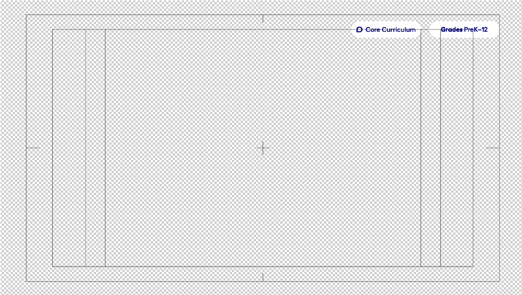
The system made use of iconography associated with each vertical within the portfolio, and was scalable to any context in which a breadcrumb might appear especially with regard to color, context, and legibility. The appearance of breadcrumbs is rigidly maintained across all channels. Placement is adaptable based on context (print, web, video) with provided guidance.
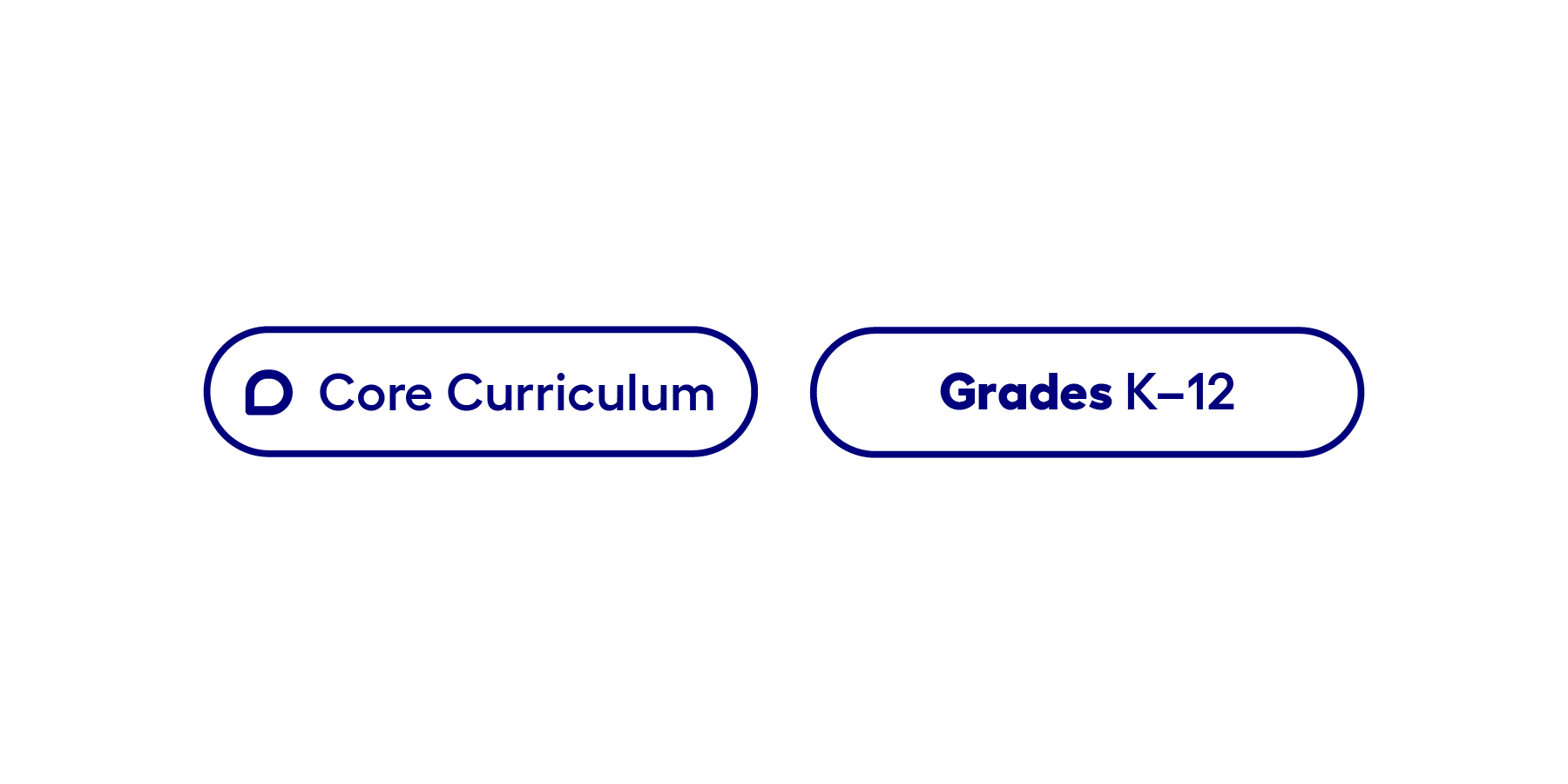
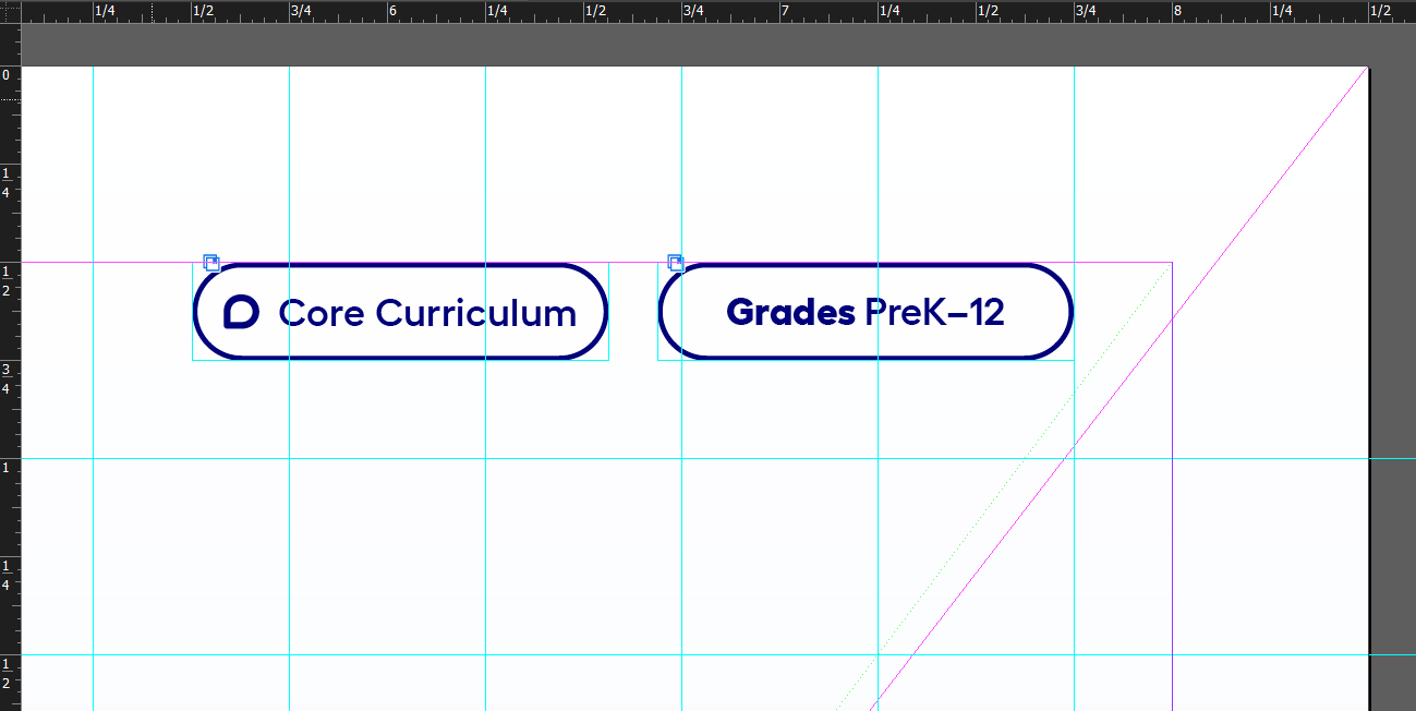
Breadcrumbs start with product vertical followed by grade band (l-to-r).
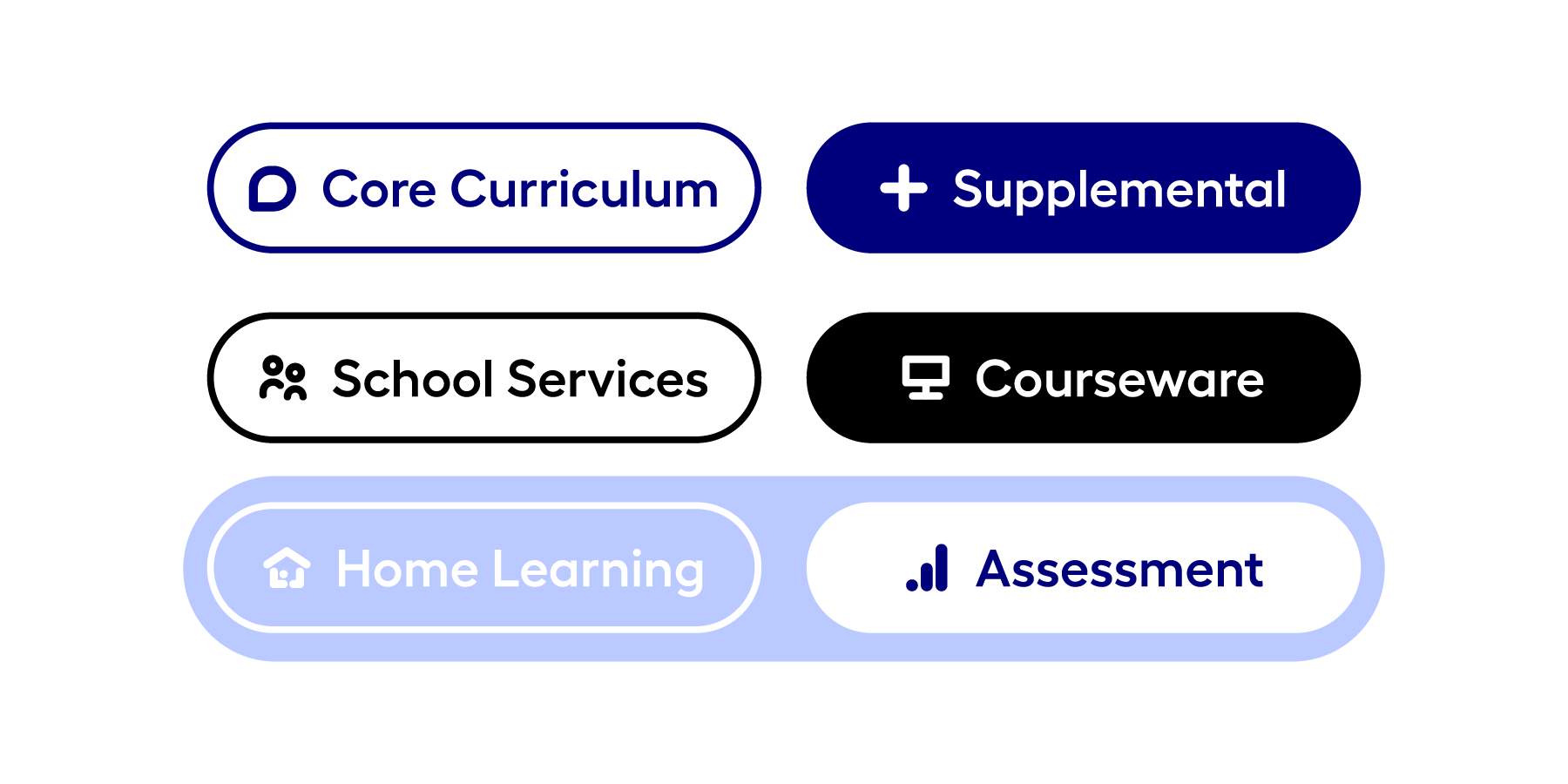
The family of product verticals and variants of breadcrumb styling.
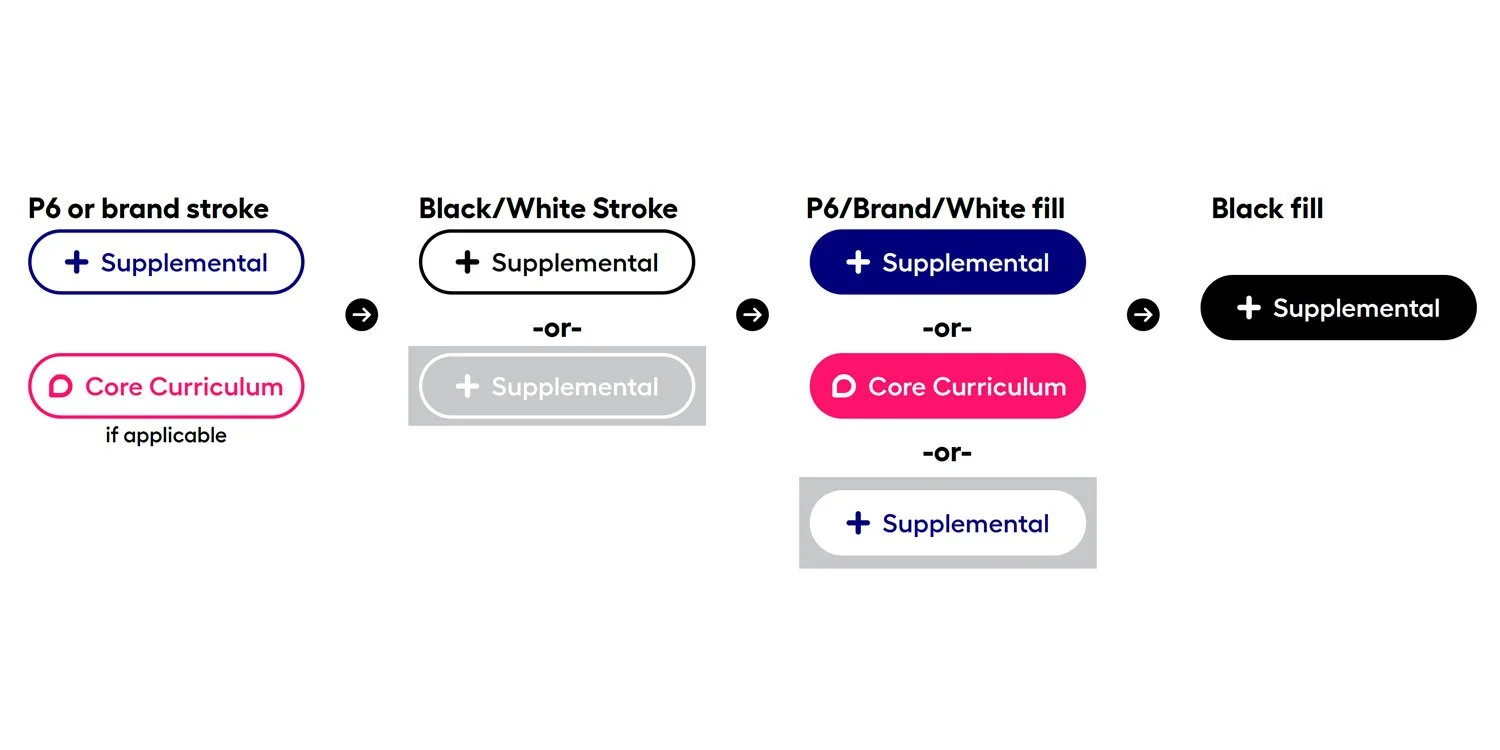
Guidance on hierarchy of color use and breadcrumb style
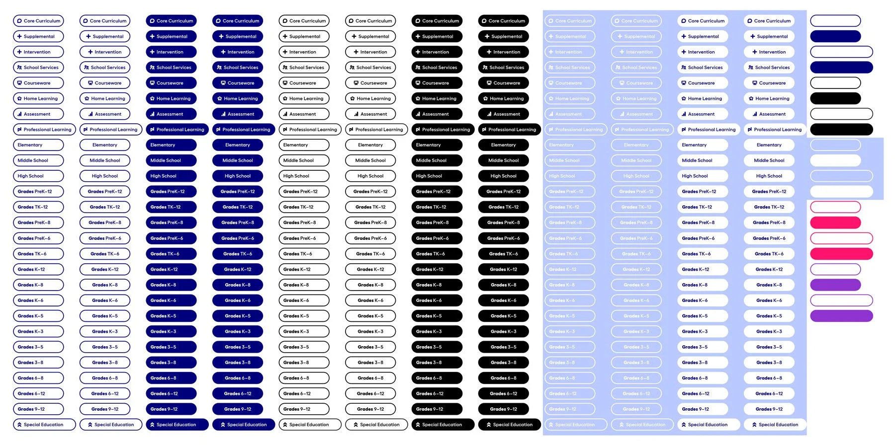
The entire breadcrumb set.
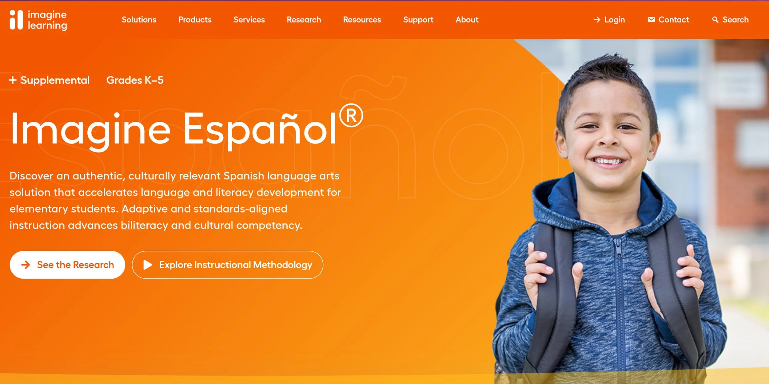
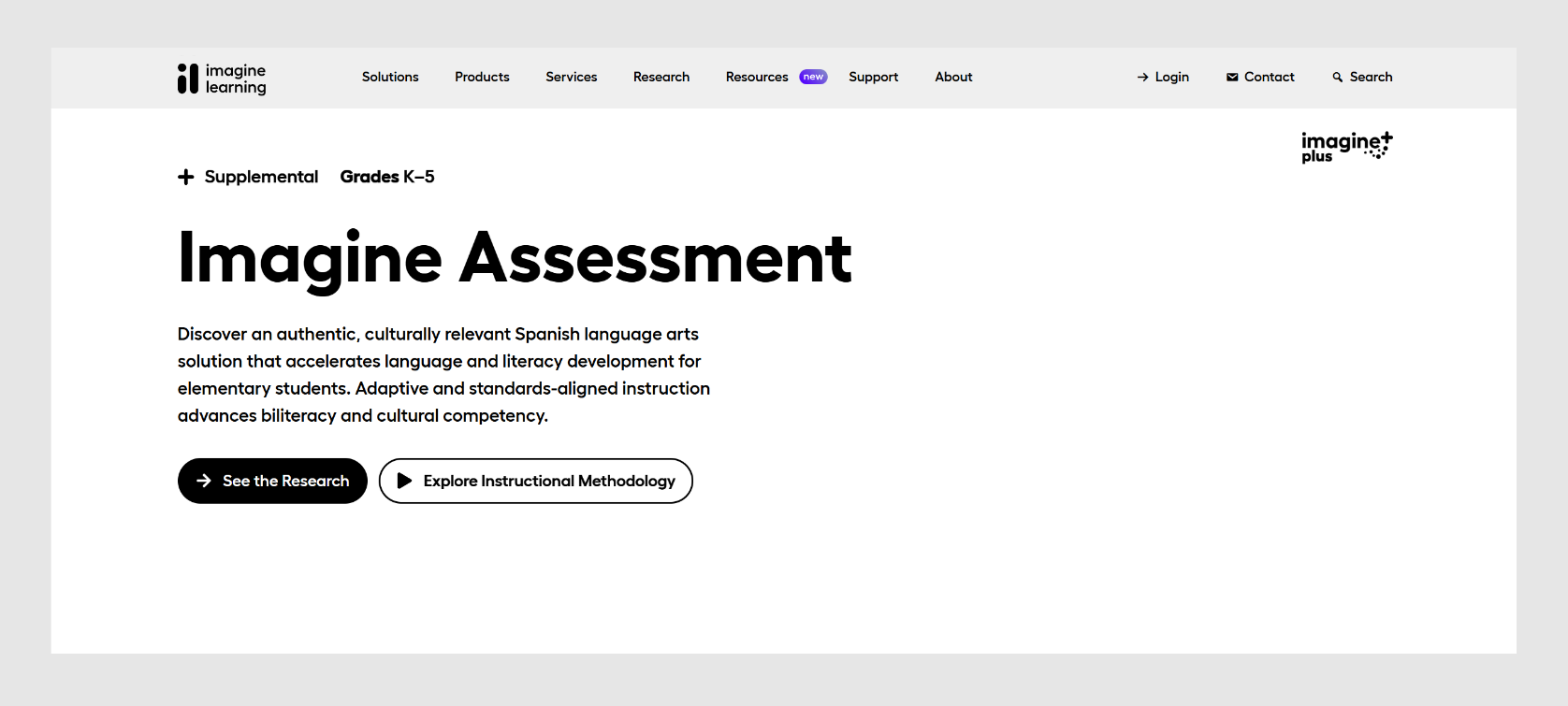
Breadcrumb on product page (modified reduced visual footprint)
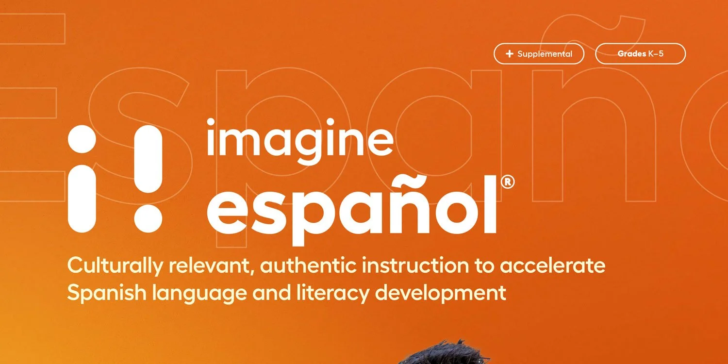
Breadcrumb appearance on brochure cover
BOILERPLATE
To keep things consistent across all Imagine materials, we devised a simple boilerplate presentation of general contact information to be included at the 'end' of every artifact or asset associated with Imagine Learning. For print and video assets, the font, size, weight and placement remained identical.
This ensured that every single piece of collateral going into the world was imminently connected back to Imagine and that this information was placed in the exact same location every time. This additionally gave content teams the ability to layer additional, more bespoke contact information elsewhere in the asset if desired.

Phone, bullet separator, email order should be maintained.
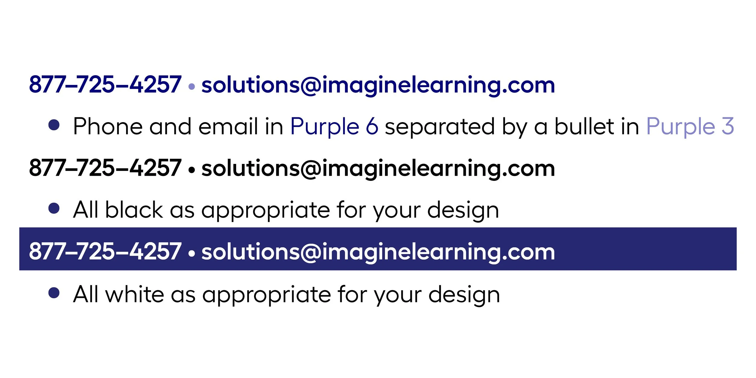
Approved boilerplate colorways.

Boilerplate information on flyer

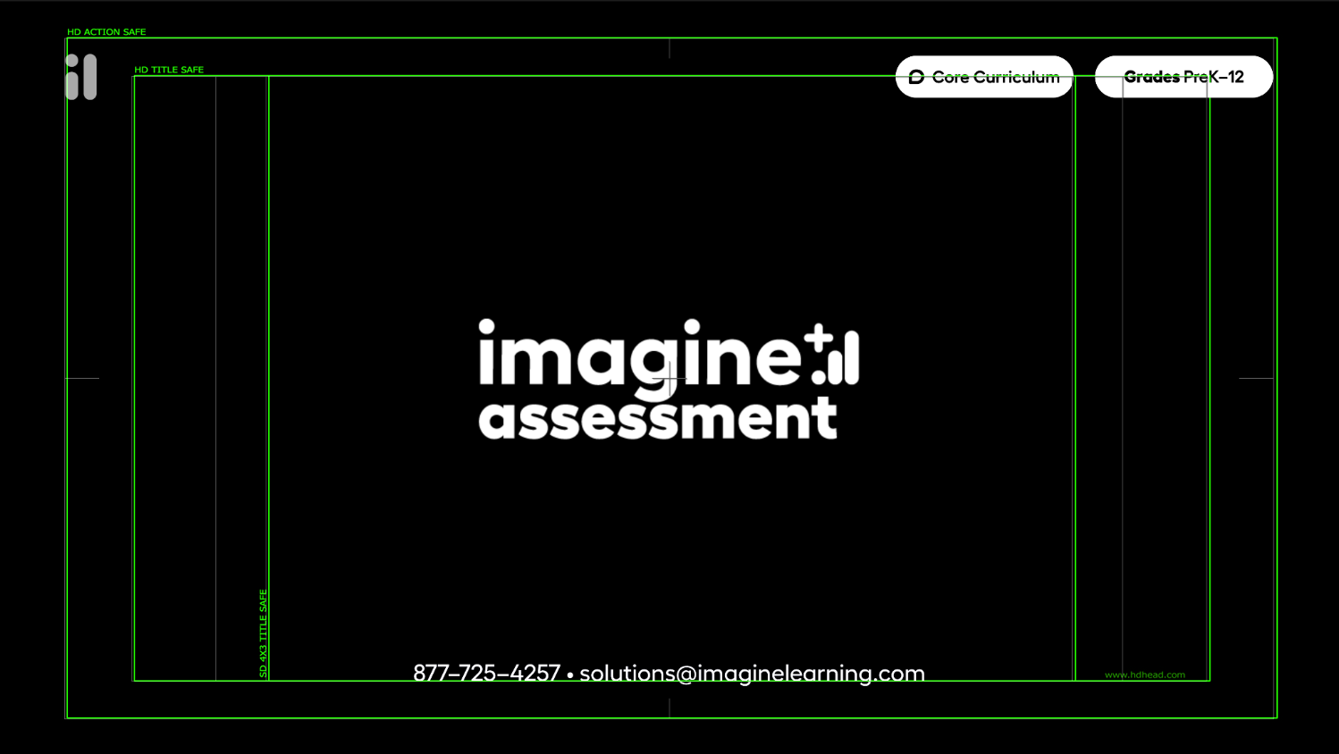
Boilerplate info on video outro
application
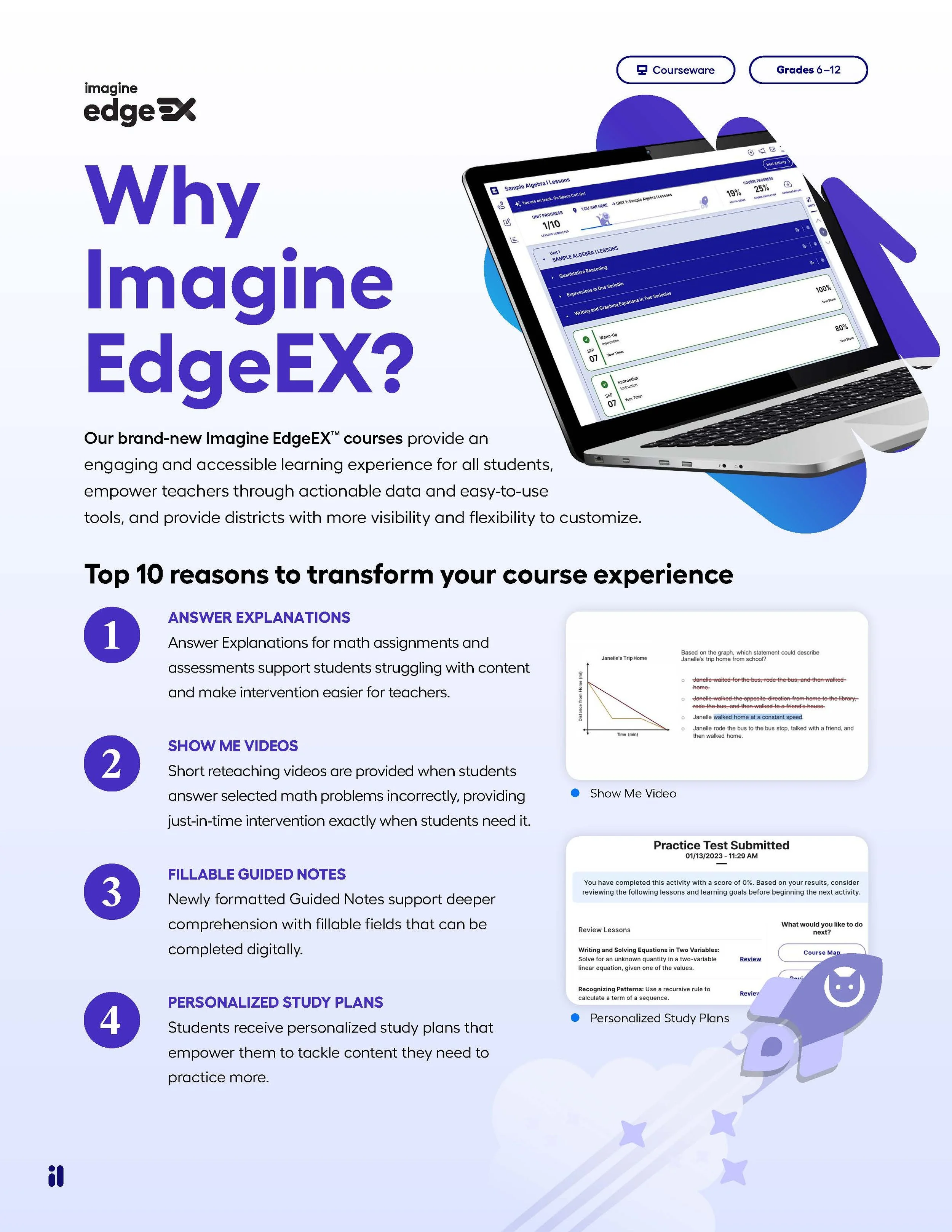
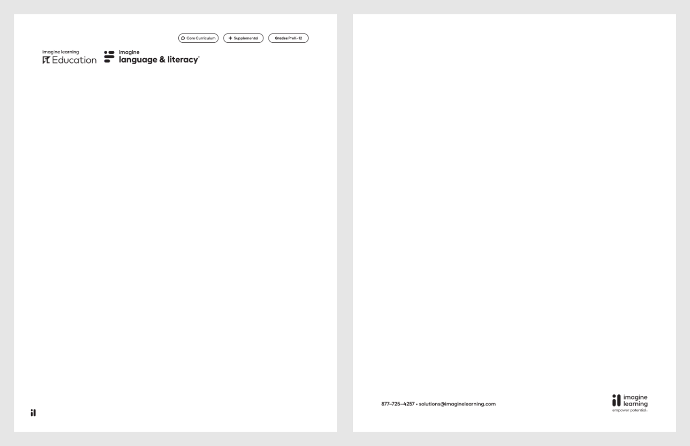
Breadcrumbs and monogram on flyer front
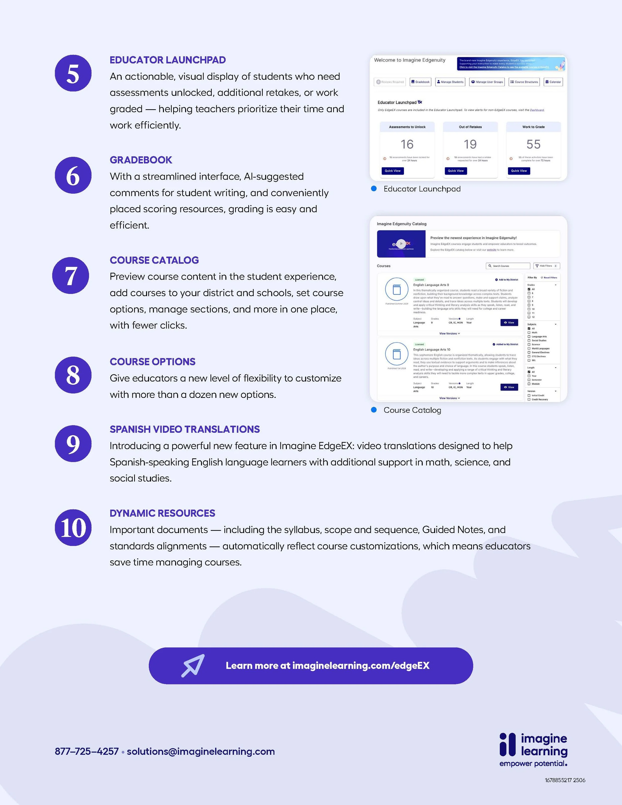
Boilerplate and approved logo flyer back

Breadcrumb (and lower third) animation reference
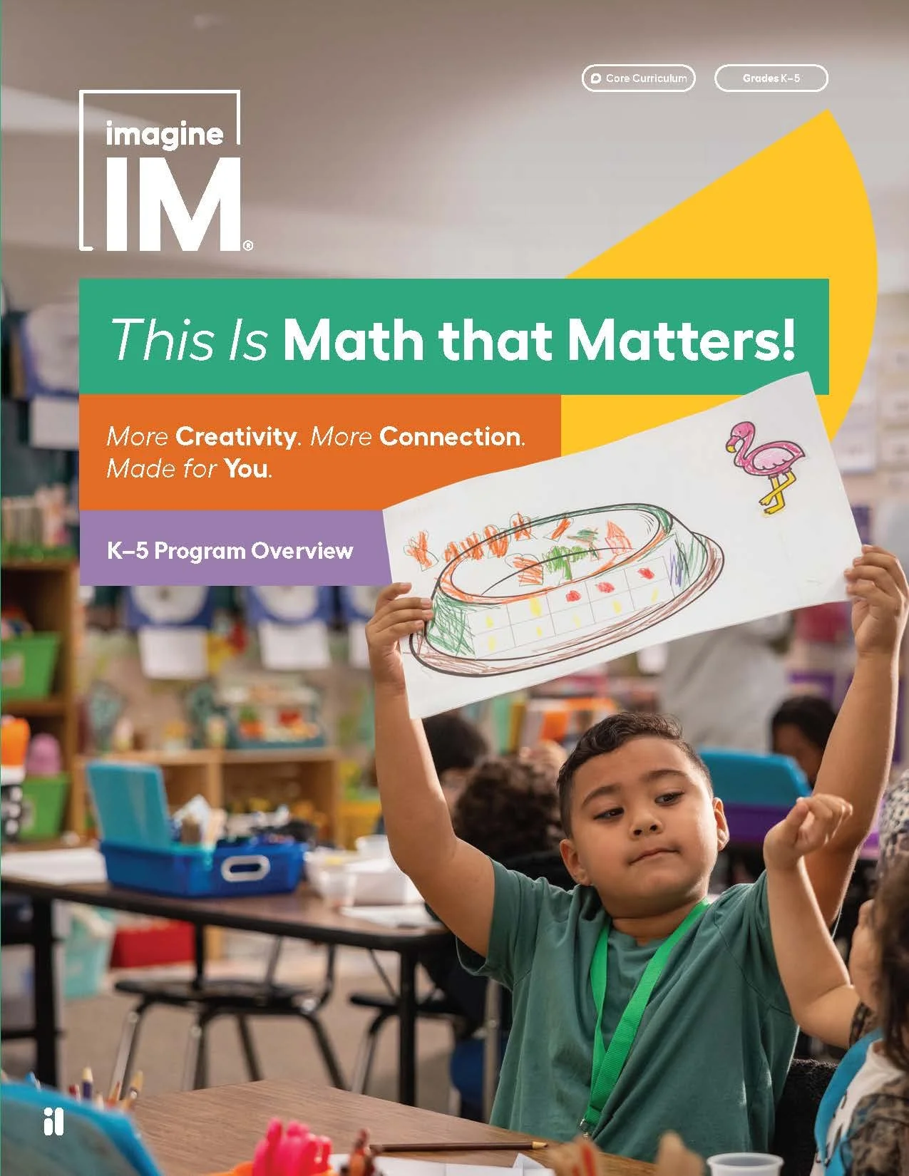
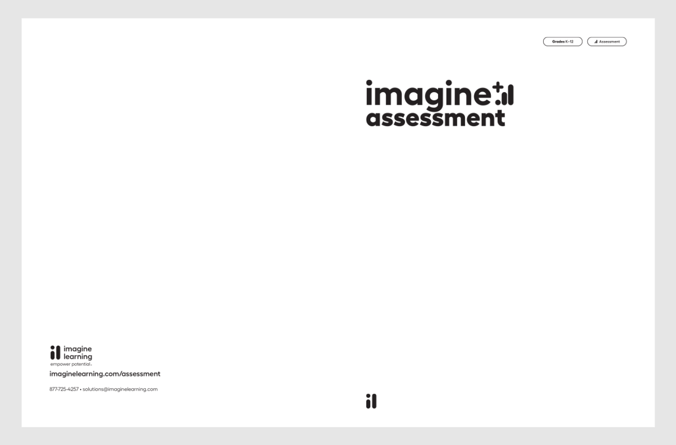
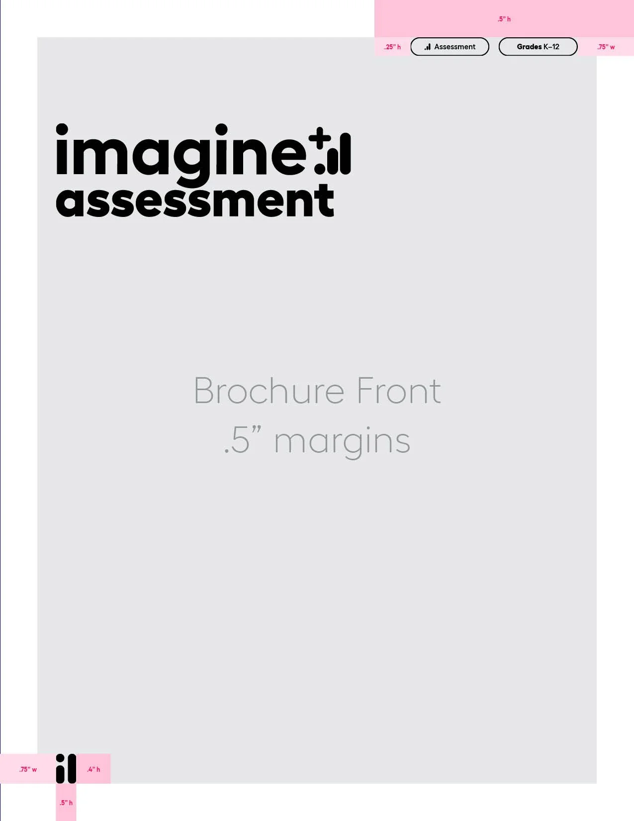
Breadcrumbs and monogram on brochure cover

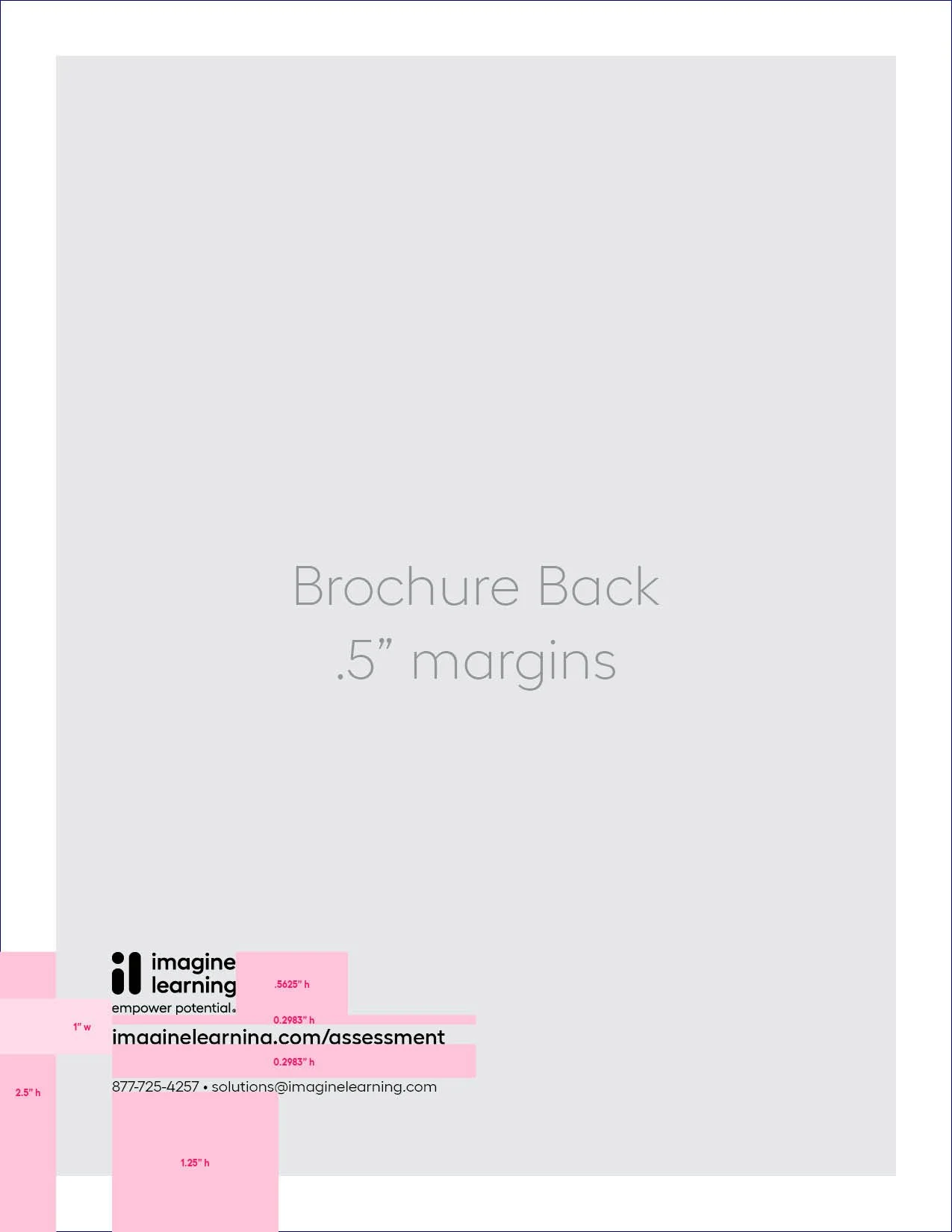
Boilerplate and approved logo brochure back cover

National ad showcasing breadcrumbs
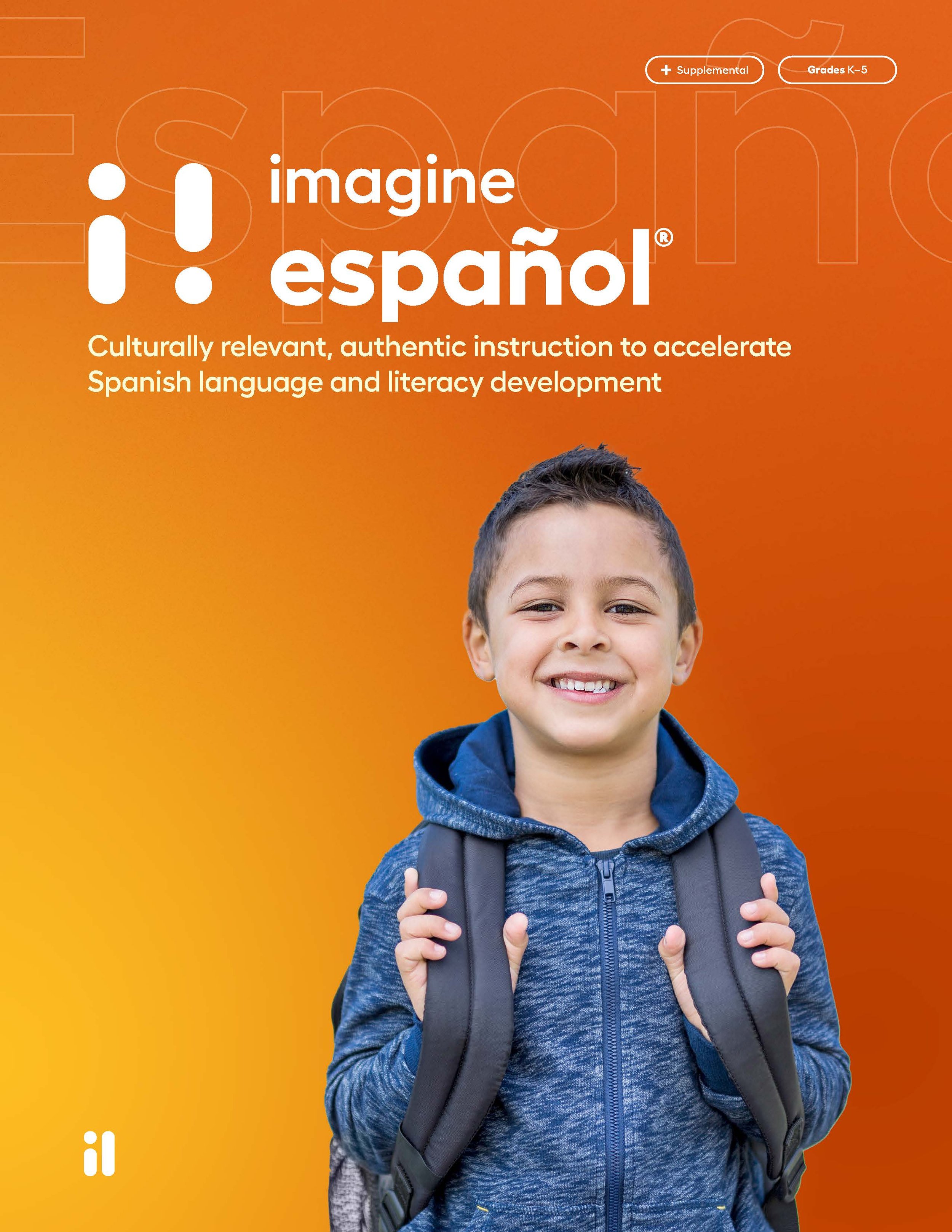
Breadcrumbs and monogram on product brochure cover
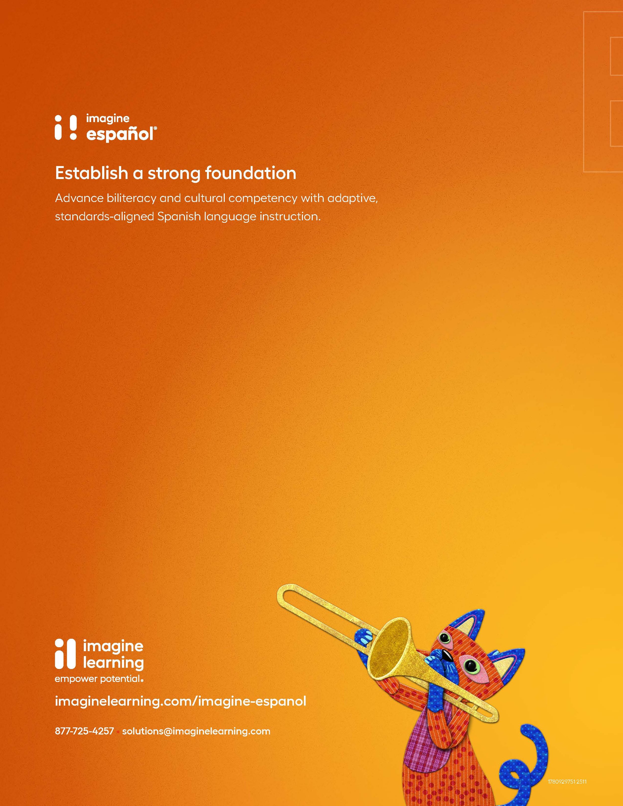
Boilerplate and approved logo brochure back cover
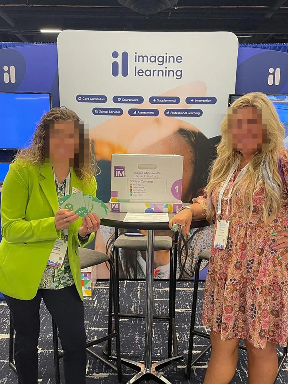
Breadcrumb usage on event signage
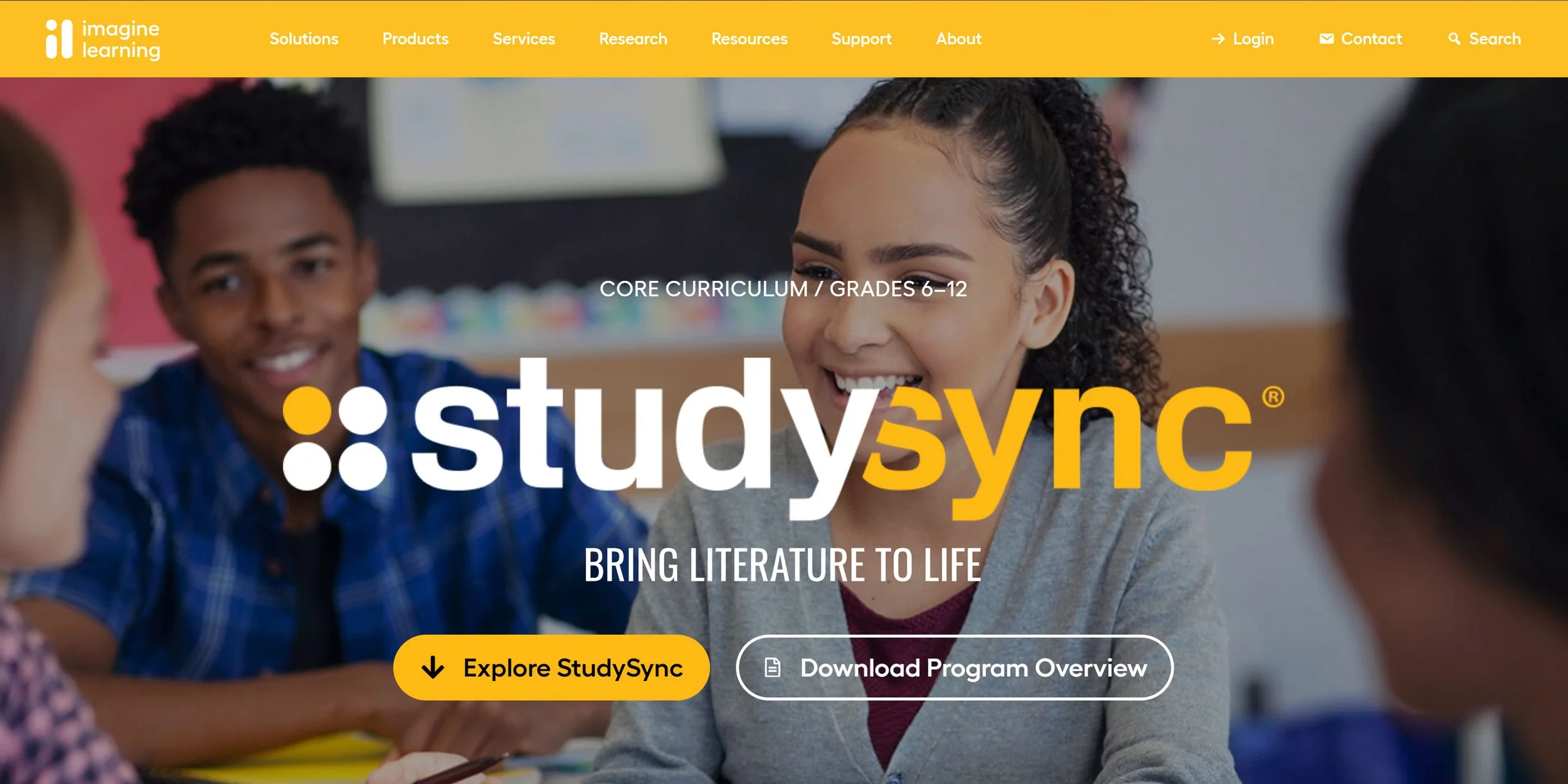
Breadcrumbs on core product webpage
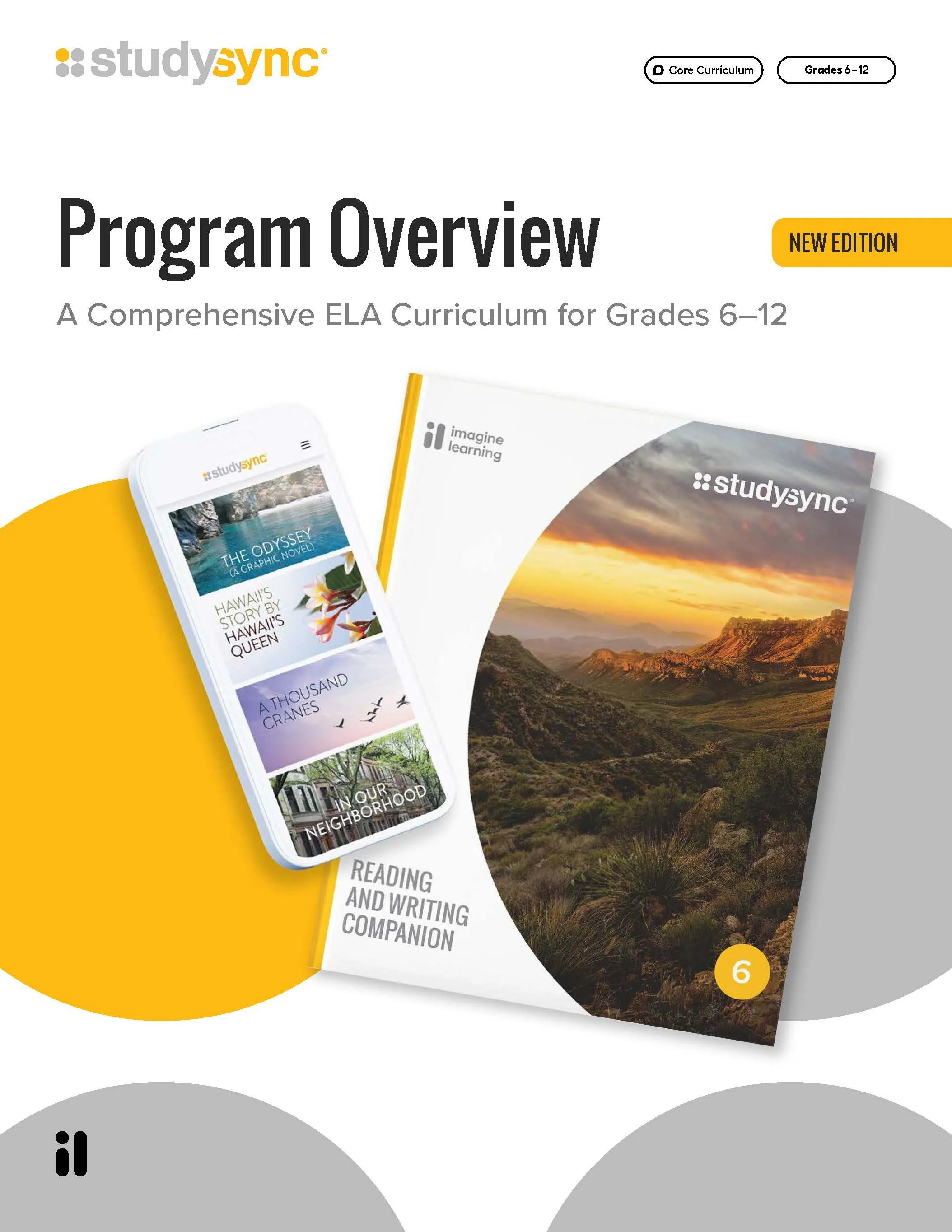
Breadcrumbs and monogram on core product brochure
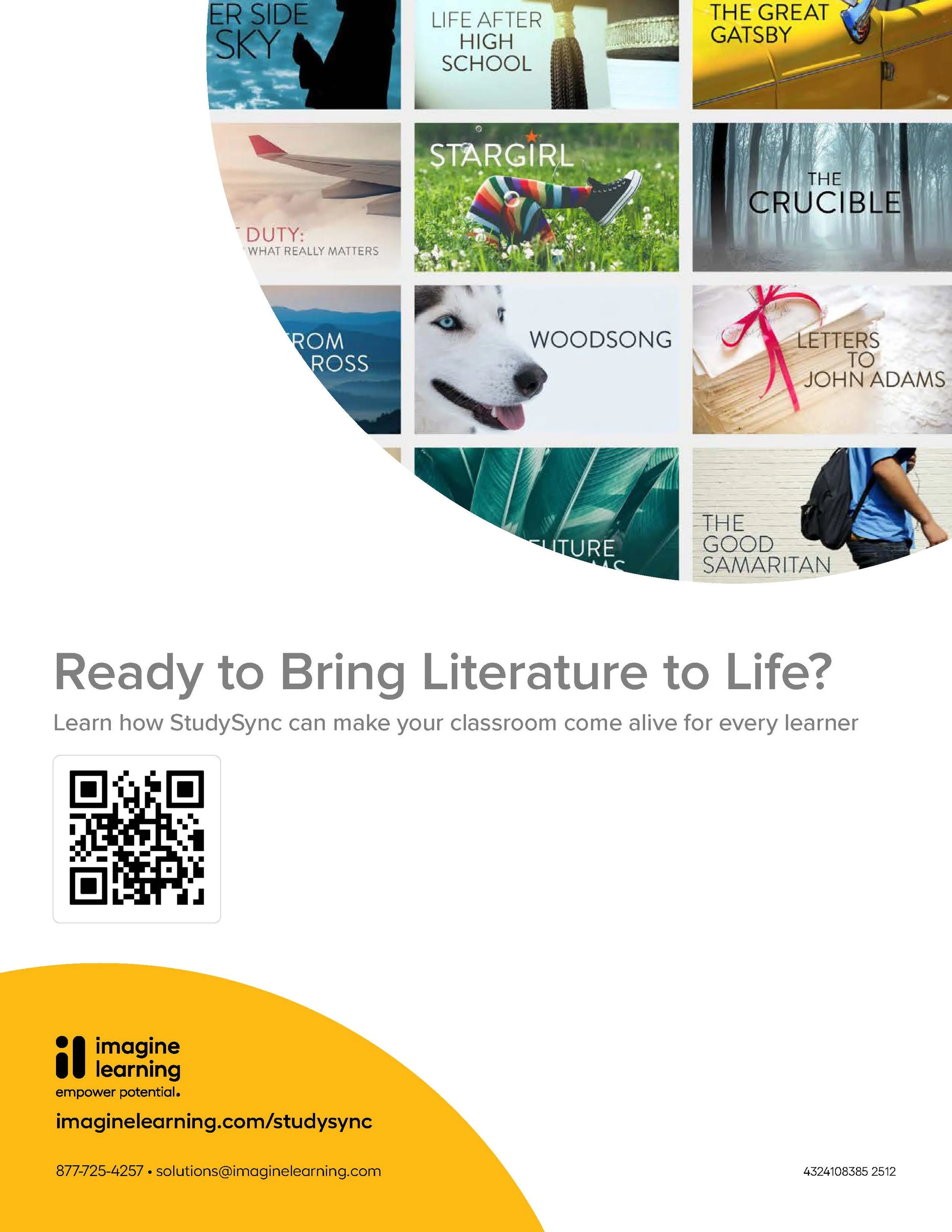
Boilerplate and approved logo on core product brochure

National ad showcasing breadcrumbs
Monogram watermark and breadcrumb animation
Approved logo build and boilerplate information
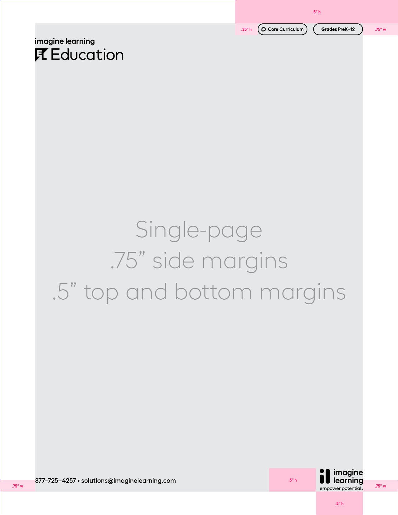
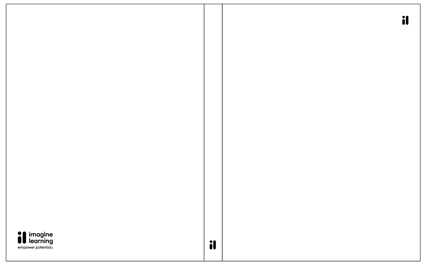
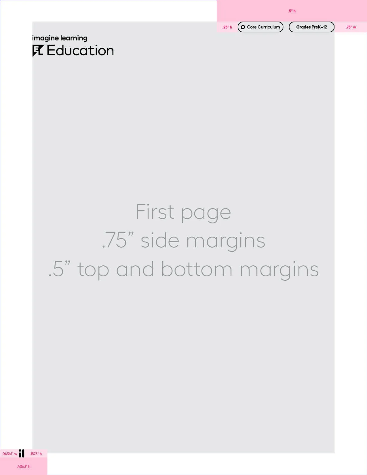
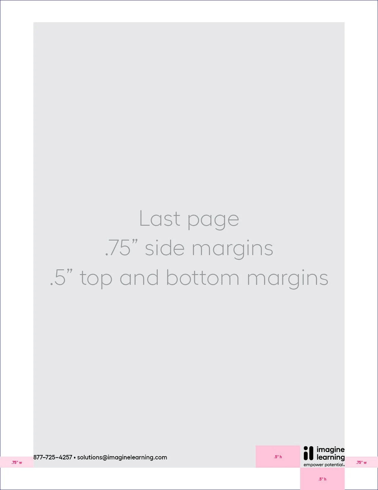
specifications
Various guidance, wireframe, and specification documents presented here for posterity. This guidance and more viewable at: https://brand.imaginelearning.com/